Tim Vereide of Prudential Vista Real Estate sent me more of the data that he has been compiling. Thanks Tim.
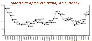
Tim Has been watching the pendings compared to the total active listings on the market. It gives a pretty good idea of what the market has been doing over time. One of Tim’s colleages has graphed this data for him. Take a look at it below. Click on the image to expand it.
This graph shows the ratio of the pending sales to the sum of the actives and pendings. Obviously, if you are a seller you want to be on the market when the ratio is high. If you are a buyer, when the ratio is low you will have more inventory to choose from and likely a more motivated seller to work with.
There are many possible explanations for the rise and fall of this ratio, but I’ll leave it to the reader to draw their own conclusions. I have been studying this graph for a couple days and have discussed it with Tim as well. I may make some comments on it later but it’s open for your comments now.


